Balance stays in context
Funds and transaction access remain visible wherever a payment begins.
Fintech · Product design · Web application · 2025
Golden Bills brings wallet funding, utility payments, mobile services and transaction history into one focused dashboard—designed to make routine financial actions feel clear, consistent and easy to verify.
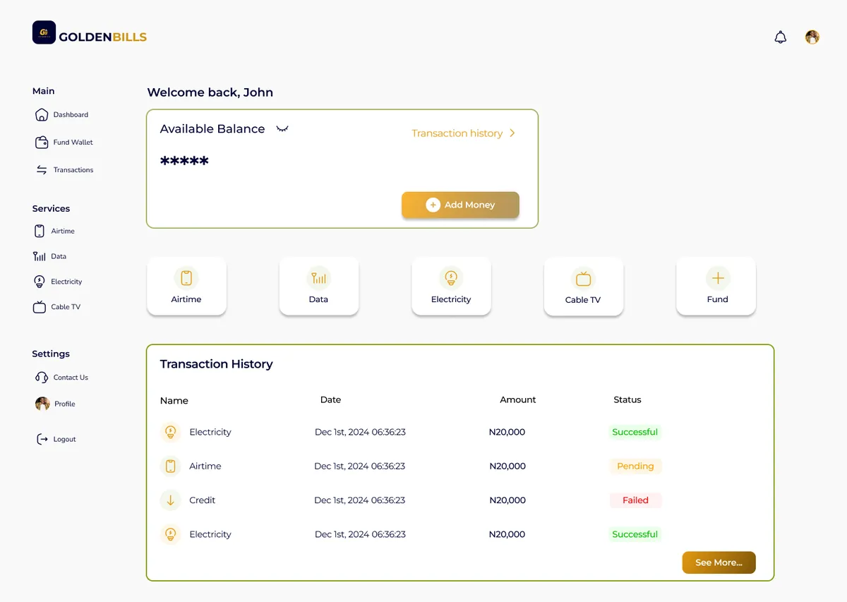
The challenge / 01
Funding a wallet, buying airtime and paying an electricity bill require different data, but users should not have to relearn the product every time. The core challenge was to create a shared structure that could handle each service’s requirements while preserving confidence, speed and clear feedback.
Funds and transaction access remain visible wherever a payment begins.
Shared forms and actions reduce the learning cost between services.
Success, pending, failure and validation states help users know what happened.
The foundation / 02
The funding flow carries the dashboard’s balance context into a single-purpose amount form. Requirements are explained beside the input, while the payment action stays visually separate until the user is ready to continue.
Wallet balance · Amount input · Payment handoff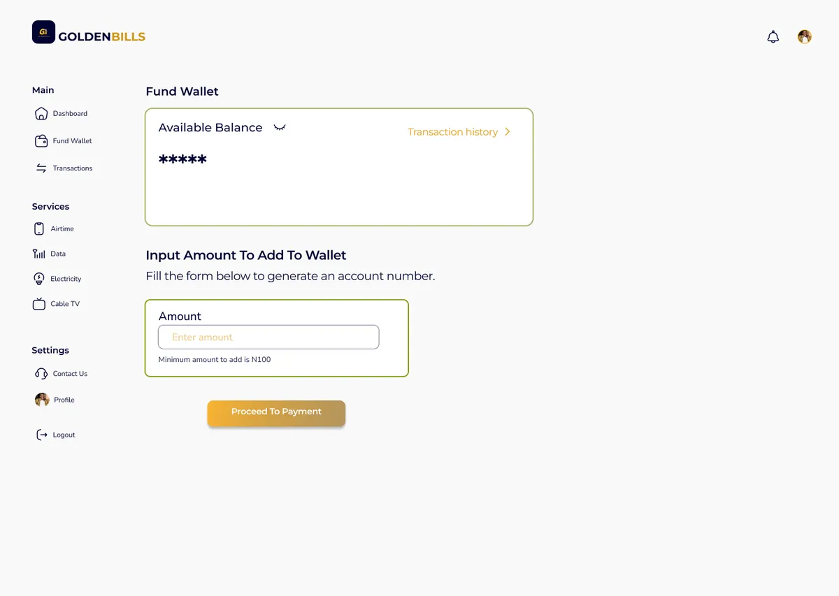
Service system / 03
Each flow keeps the same shell—navigation, balance, form container and primary action—then introduces only the fields needed for that service. Familiarity does the heavy lifting.
A focused purchase path for amount, phone number and network selection.
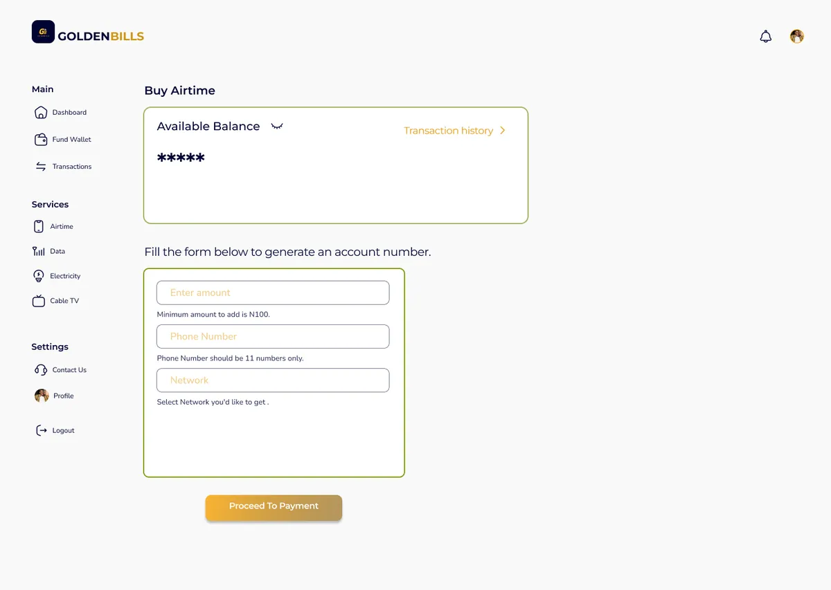
The same familiar pattern keeps repeat payments quick and predictable.
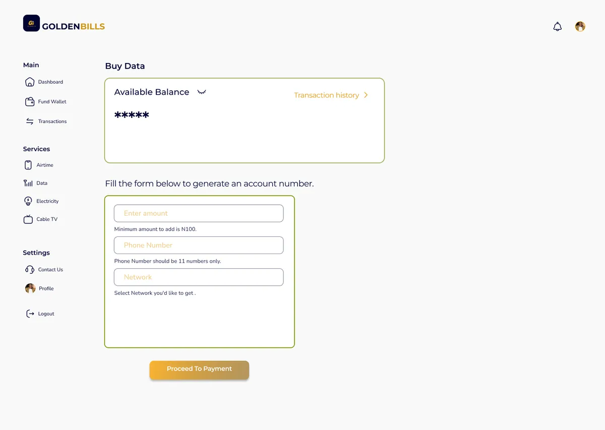
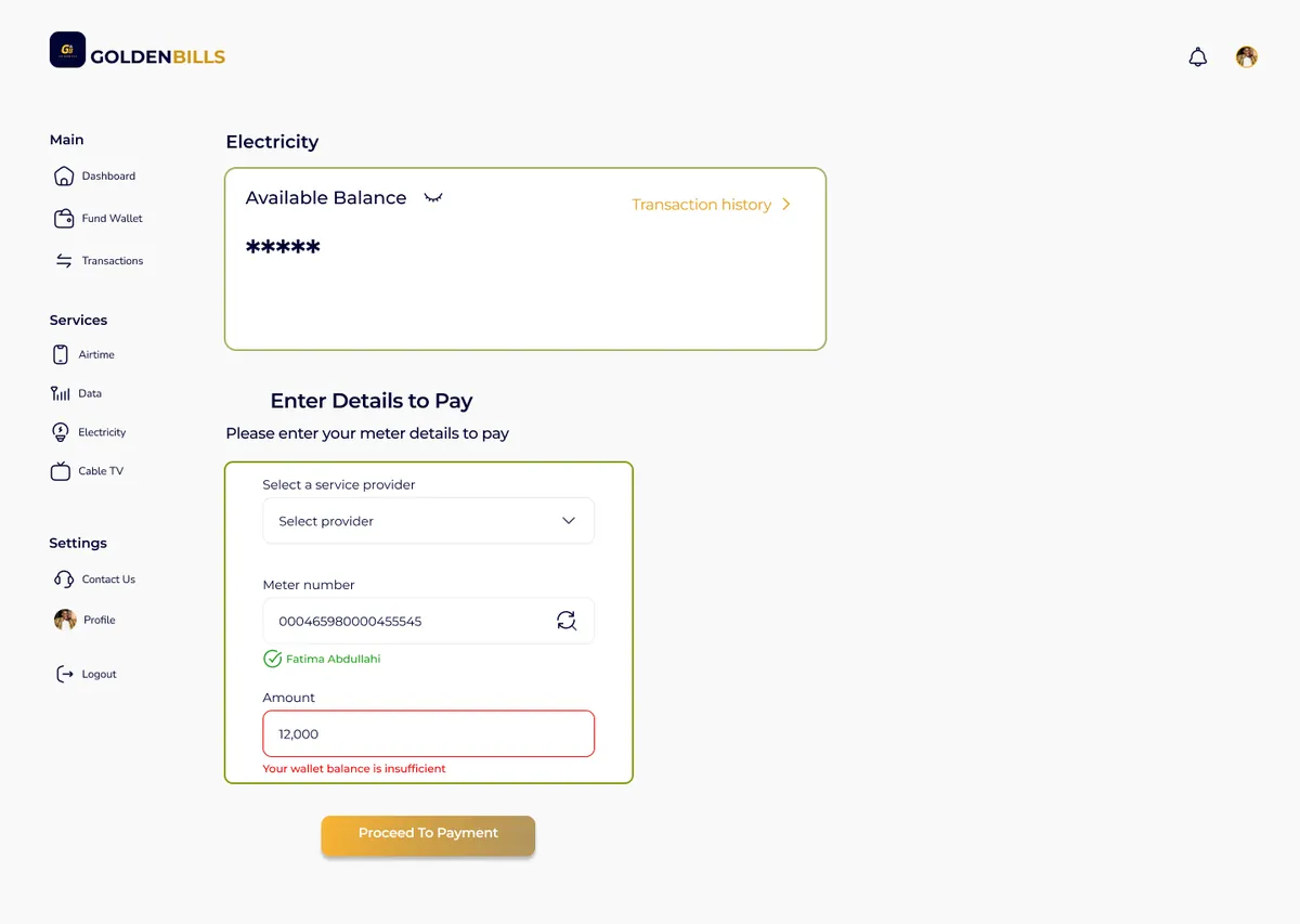
Provider and meter verification surface identity and balance errors before payment.
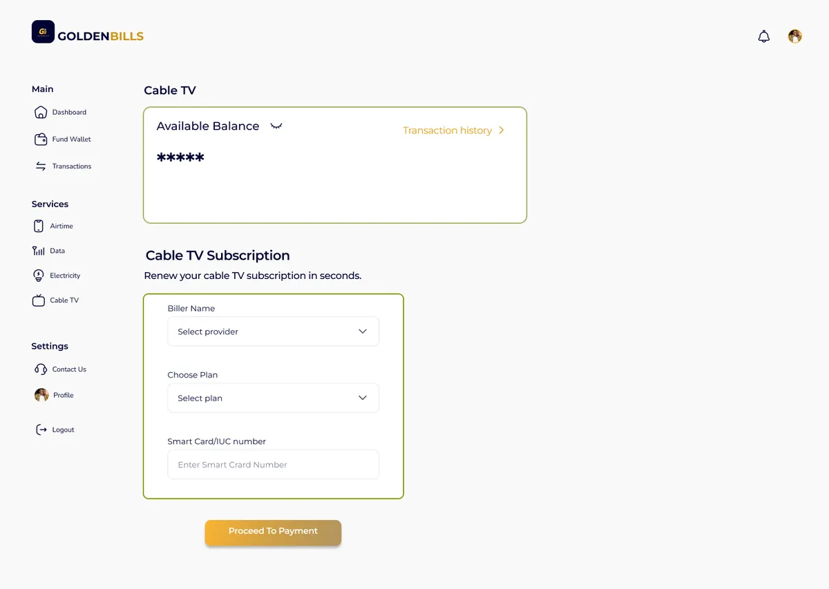
Provider, plan and smart-card details are sequenced in a simple subscription flow.
Feedback and traceability / 04
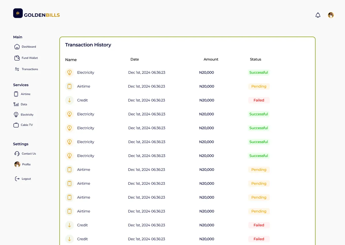
Transaction history turns system activity into something users can verify. Names, dates, amounts and colour-supported status labels create a fast scanning pattern without relying on colour alone.
Beyond payment / 05
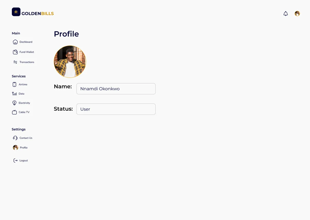
A lightweight account view keeps identity and access status immediately visible.
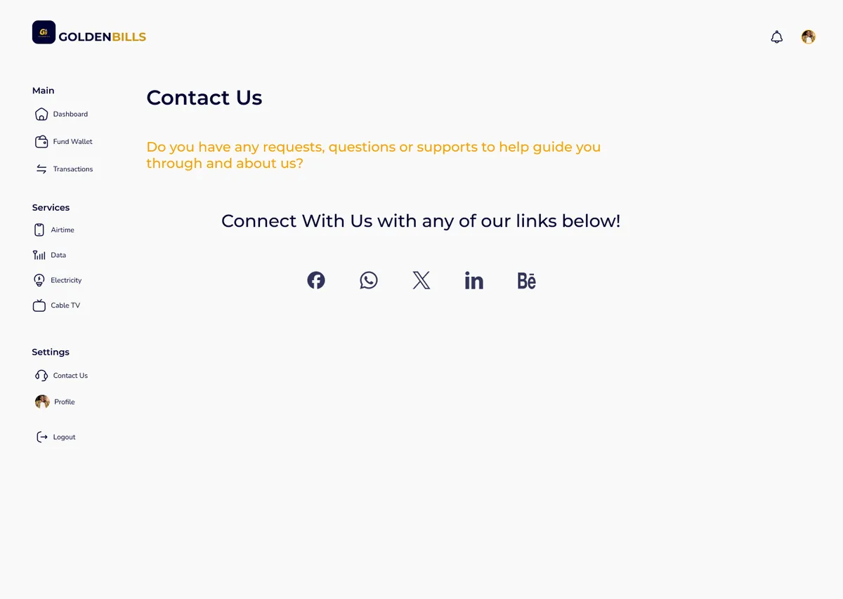
Contact channels are gathered into one uncluttered support destination.
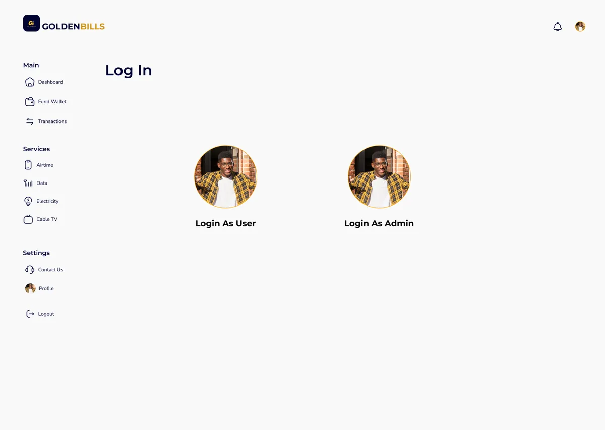
User and administrator entry points remain distinct when a session ends.
Design system and delivery / 06
Golden Bills uses shared rules for navigation, balance cards, form containers, actions and feedback. That consistency makes the experience easier for users and gives implementation a clearer, more scalable foundation.
Dashboard architecture, service grouping and end-to-end payment flows
Figma, reusable components, form states and high-fidelity screens
Balance visibility, meter validation, errors and transaction statuses
Consistent inputs, provider selection and progressive payment actions
Shared navigation, cards, tables, form patterns and visual tokens
Responsive specifications, prototypes and implementation-ready states
What the project demonstrates / 07
Financial products feel simpler when the interface makes every requirement, action and outcome visible.
Golden Bills demonstrates my ability to turn several connected services into one coherent product language. The work balances visual identity with practical fintech needs: validation, transaction feedback, repeatable interaction patterns and a dashboard that keeps the user oriented.