Authority without noise
Strong type, disciplined grids and confident spacing communicate capability without over-selling.
Brand website · Product design + development · 2026
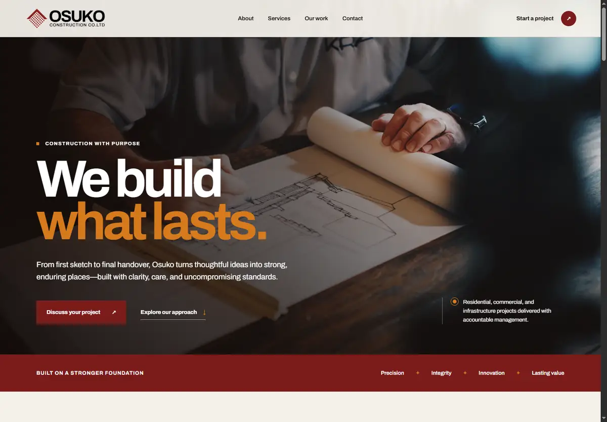
OSUKO Construction needed more than an online brochure. I designed a responsive company website that makes its purpose credible, its services understandable and the next step easy for prospective clients.
The challenge / 01
Construction decisions carry cost, time and trust. A visitor needs to understand who the company is, what it can deliver and how it works before making contact. The experience had to feel established and distinctive while remaining direct enough for busy prospects.
Strong type, disciplined grids and confident spacing communicate capability without over-selling.
Services and the delivery process are described in concrete, useful language.
The narrative progresses from purpose to capability, proof and a focused enquiry.
Responsive by design / 02
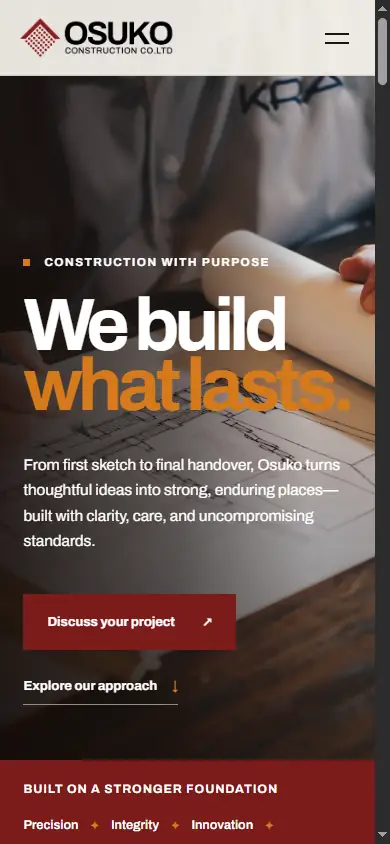
On mobile, the hierarchy tightens without losing the brand: navigation becomes compact, the headline keeps its impact, actions remain thumb-friendly and the construction imagery continues to carry the atmosphere.
Experience walkthrough / 03
Services
Residential construction, commercial projects, project management and civil works needed to feel connected without becoming a wall of information. A numbered service system and generous spacing let prospects understand the company’s range in seconds, then slow down for detail.
Information architecture · Service hierarchy · Editorial layout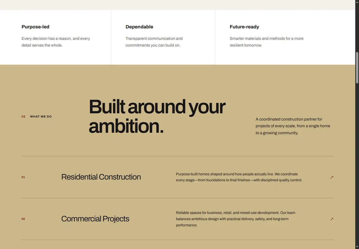
Process
Construction clients need visibility as much as ambition. The four-step process—from discovery and planning to communication and handover—turns an operational promise into a reassuring, concrete story. The split layout balances technical structure with human confidence.
Process storytelling · Trust signals · Visual rhythm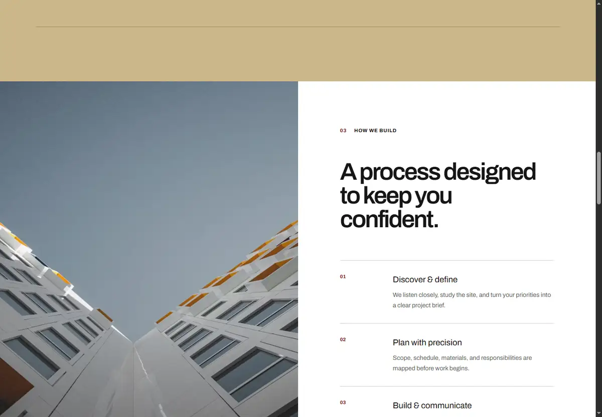
Selected focus
Large, carefully framed imagery gives the portfolio section weight while the surrounding typography keeps it connected to the brand system. The composition moves between residential character, active delivery and precision-led execution without losing hierarchy.
Image direction · Project framing · Responsive composition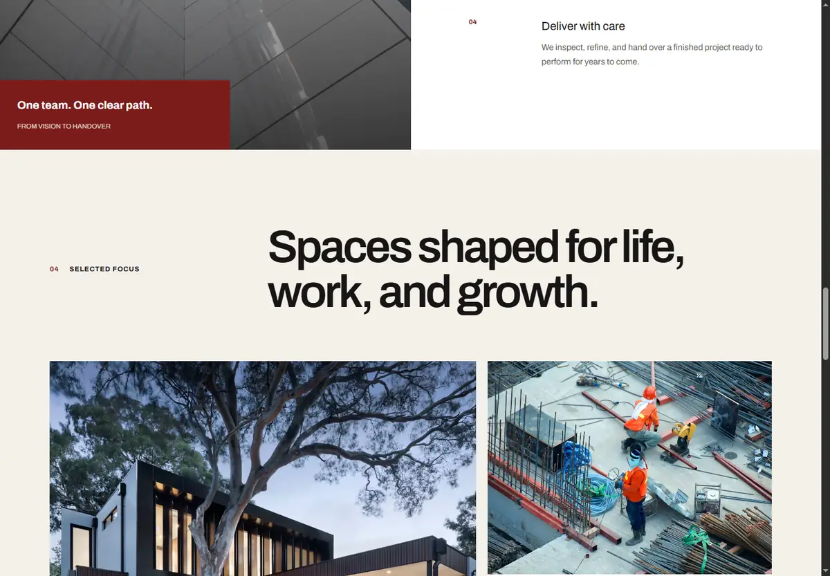
Conversion
The enquiry section asks for only the details needed to begin: contact information, project type and a short brief. Clear direct-contact alternatives and the deep-red brand field make the call to action feel like the natural conclusion to the story—not an interruption.
Lead capture · Form UX · Contact strategy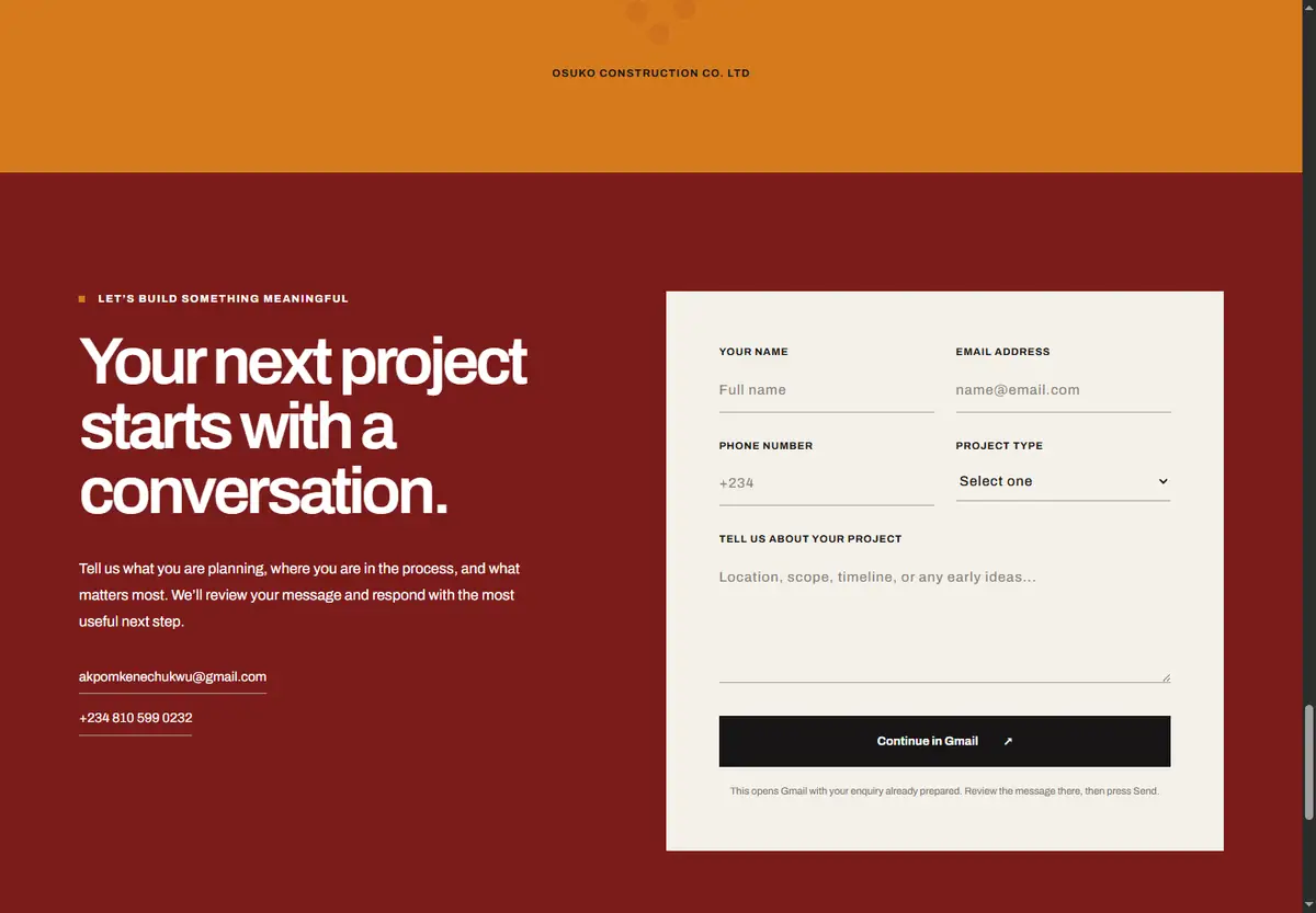
How it was built / 04
I carried the design logic into a component-based Next.js build, preserving the editorial rhythm across screen sizes and connecting the final experience to a practical enquiry path, production hosting and visitor analytics.
Figma, responsive layouts and a reusable visual system
Next.js / React with component-based page architecture
Semantic HTML, modern CSS and responsive breakpoints
Smooth navigation, purposeful motion and accessible controls
Structured enquiry flow with prepared email handoff
VS Code, GitHub, Vercel hosting and Vercel Analytics
The outcome / 05
Built with the same principle as the company: every detail should support the whole.
The finished site gives OSUKO a distinct, professional presence and gives prospective clients a clear route from curiosity to contact. It demonstrates my ability to connect brand thinking, responsive product design and front-end implementation in one coherent delivery.
Experience the live website ↗